Good design is
visible
A library of UX inspirations so good that they almost feel invisible
In your inbox, weekly, FREE! 🚀
Welcome to the feed!

Figma
Lock Aspect Ratio Animation
Width and height fields smoothly connect with a subtle animation, truly a visual delight - intuitive & satisfying


Apple
Zero lag typing experience
iPhone lets you start typing text even before the actual keyboard appear animation has completed, eliminating lag and frustration while making the device feel faster.


Netflix
Delete and Play Next
CTA dynamically changes from the usual 'Play Next' to help users free up storage automatically without manual management, ensuring they always have space for upcoming episodes


Airbnb
Scrolling up Triggers a CTA Nudge
When a user scrolls down, they are typically understanding the page. After this exploration, when they scroll back up, the interface maps user intention of having understood about the offering & intelligently displays a nudge on call-to-action (CTA). This moment is strategically chosen to re-engage the user after they have absorbed enough information to feel ready to act.
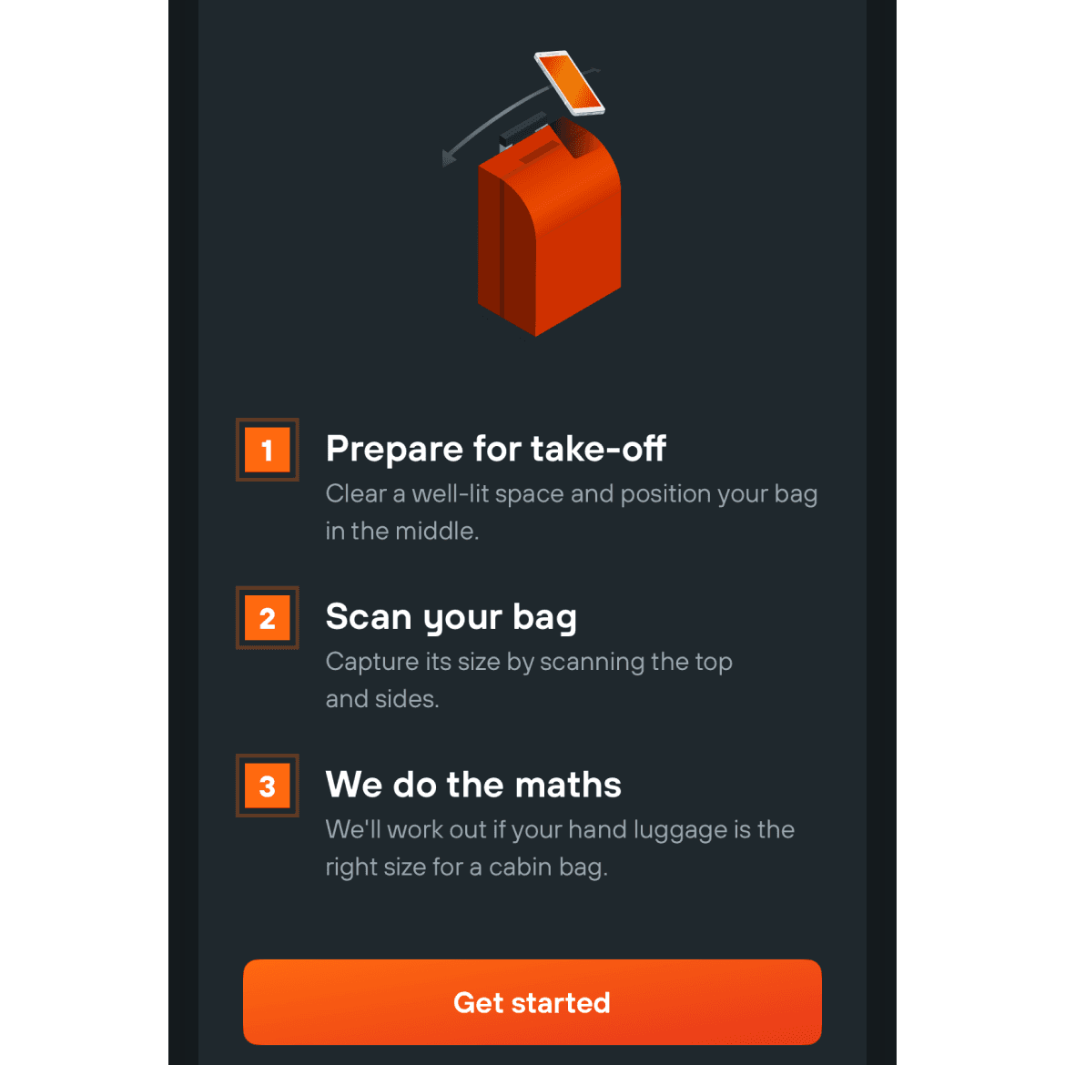

Kayak
Measure your bag
Helps users quickly check if their luggage meets airline size requirements, removing guesswork and simplifying pre-travel preparations.

Airbnb
Recommended Filters
Remembers the amenities you frequently filter for & suggests them in future searches. This personalization saves users time by reducing the need to re-enter the same preferences. A small but powerful way to streamline the interface and make users feel understood.

Framer
Instant Edit Shortcut
When you visit your published Framer site while logged into the same account, a tiny popup quietly appears, offering a direct "Edit in Framer" button — cutting the friction between seeing and updating your live work


Zomato
A New Rating System
Old text-based ratings ("4.2 ★, 230 ratings") replaced by a compact thermometer chart to show Highly Reordered items, solving the same purpose as reviews while eliminating any mental calculation


